Delightful Components
Pencil - Brainly Design System
Introduction
In today's digital era, a static interface is no longer sufficient. Adding motion to our designs not only makes them more engaging, but also improves functionality. This is where Motion Design comes in! Through strategic incorporation of motion in our components, we can make them both functional and enjoyable to use.
In this case study, I will show some of the components we designed and how we baked-in motion into them and expanded the delightful experience throughout our entire product.
A little bit more
After successfully completing one of our major initiative focused on improving the quality of design in Brainly, it was the perfect opportunity for us to introduce a new components within motion in mind.
These new components would not only streamline the development process for the product teams but also provide a platform to incorporate motion seamlessly. By integrating motion from the ground up, we aimed to scale the delightful experience efficiently across our product.
My role
As the UX Motion Design Lead, my role was integral in ensuring that motion was effectively incorporated into each component. Given the project's objective of baking in motion from the ground up, I was involved in all the groups responsible for designing and implementing the components.
One of my primary responsibilities was preparing prototypes that showcased the desired motion behaviors and interactions. By considering all the states and motions, I ensured that the prototypes accurately represented the delightful experience we wanted to deliver to users through those new components.
In addition, It was my responsibility to tackle these challenges head-on and find creative ways. Whether it was a complex interaction or a unique motion, I worked closely with the team to figure out the best approaches while keeping the functionality perspective in mind.
Outcome
Press Feedback
Even thought we can't treat the Press Feedback as a component, It was something new we wanted to introduce in the experience as It would add a nice touch on top of the components. We focused on implementing press feedback across various components, including buttons, chips, cards, and more. Our goal was to create interactions that closely resembled real-world experiences. For instance, when a user tapped on a button, we designed it to scale down and then smoothly scale back up, mimicking the physical act of pressing a button.
The implementation was cost-friendly and allowed us to achieve a significantly visible result without requiring extensive development efforts for each individual component, thanks to the design system.
Checkbox
We decided to bake motion into the Checkbox with the main goal of providing better visual feedback to users. By incorporating micro-animation of the tick icon, we aimed to create a more intuitive and engaging interaction. With each selection or deselection, the motion visually communicates the state change, offering users a clear and immediate understanding of their actions.
Radio
Similar to the Checkbox component, the Radio component serves as a vital UI element for making single selections from a predefined set of options. Similar to the checkbox, we integrated motion into the Radio component with a purpose to provide visual feedback that enhanced the selection process. By incorporating subtle animations, we aimed to guide users' attention to the selected option and create a seamless and enjoyable experience.
Chips
We were able to create more delightful components, such as the chip component, thanks to the press feedback and our decision to implement micro animations inside our components. Combination of those details led us to more engaging and delightful interactions.
Tooltip
When it comes to the tooltip, I focused not only on defining the proper timing and easing for its appearance and disappearance but also on creating motion that visually emphasized the connection between the tooltip and the UI element it belonged to. To achieve this, I decided to make the tooltip's appearance align with the position of the associated UI element.
Progress Bar
At first glance, we might assume that adding motion to the Progress Bar component is a straightforward task. Applying a simple "ease" and "duration" token may seem like the solution. However, as we dived deeper into the component's functionality, we realized that a more thoughtful approach was necessary.
The Progress Bar component could include multiple steps and because of that the progress indicator's speed could look different in some scenarios. Applying a fixed duration, such as 400ms, for every amount of progress seemed inconsistent. Because, sometimes the indicator would move too quickly, while other times it would appear too slow, especially when the progress was minimal.
We recognized the need for a logical approach to maintain consistent speed throughout the progress indicator's movement. We needed a solution that would adapt the duration based on the progress made. After careful consideration, we had a plan: we would dynamically adjust the duration based on the progress indicator's movement. For instance, if the progress was less than 100px, we would apply a duration of 300ms. If it ranged between 100px and 200px, we would use a duration of 400ms, and so on. This approach ensured that the speed of the progress indicator remained consistent, regardless of the progress's magnitude.
By implementing this logic, we achieved a cohesive and smooth motion experience within the Progress Bar component.
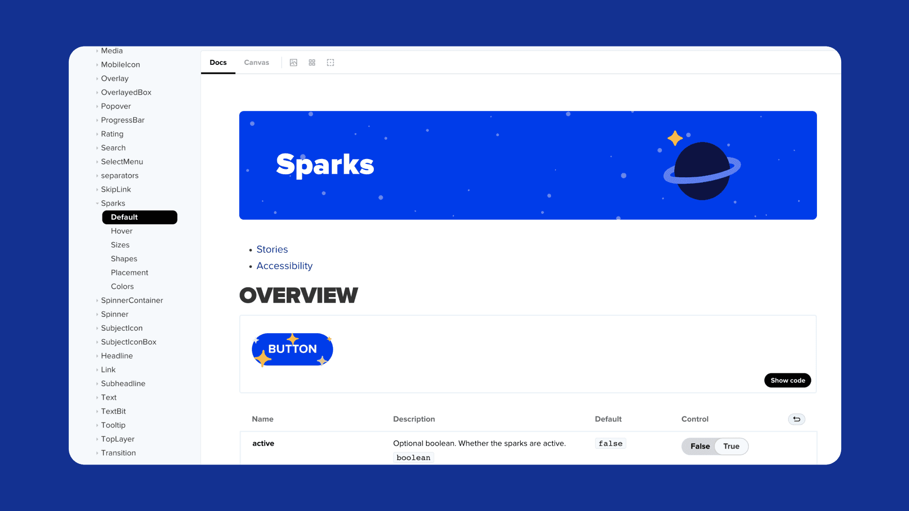
Sparks
The Sparks component was conceived with the intention of bringing delight to the user experience while also serving as a versatile tool for product teams to capture user attention around specific calls to action (CTAs). It could be used to highlight new features, increase visibility, or boost click-through rates.
Creating a flexible and dynamic component with extensive customization options was the main challenge we faced. We wanted the Sparks component to adapt to any designer's needs while remaining easy to implement. This required providing controls for adjusting icons, choosing variants (small, medium, or large), setting animation duration, delay, iteration delay, colors, placement, width, height, and interactivity options such as mouseover-triggered animation or automatic playback.
To meet these requirements, we adopted a systems thinking approach. I designed the motion of the the Sparks component with three distinct sequences: the appearing animation, the middle animation, and the disappearing animation. This structure allowed our lead engineer to playback the animation with various controls and settings.
The appearing animation sequence marked the initial entrance of the sparks, catching the user's attention.
The middle animation sequence, which could be adjusted in duration, played in a dynamic and choreographic manner, featuring multiple icons within the sparks component.
The disappearing animation sequence smoothly transitioned from the middle animation, ensuring a seamless exit.
By merging creativity, system thinking, and technical expertise, we successfully a powerful Sparks component. Its ability to adapt to different requirements made it a valuable asset for designers and an effective tool for capturing user attention.
Credits:
Giga Khurtsilava - Lead UX Motion Designer (My role)
Patrycja Rozmus - Senior Manager & Team Leader
Łukasz Krebok - Manager, Design System (Product)
Maciej Nowak - Lead IxD Product Designer
Dina Sabat-Sporysz - Senior Product Designer
Olga Wysopal - Product Designer
Justyna Guła - Visual Designer
Michał Skowronek - Lead UI Engineer
Bartosz Adamczyk, Dominika Podgórska and Katarzyna Tobiś - Senior Software Engineers
Michał Jałbrzykowsk - Senior Motion Designer
Delightful Components
Pencil - Brainly Design System
Introduction
In today's digital era, a static interface is no longer sufficient. Adding motion to our designs not only makes them more engaging, but also improves functionality. This is where Motion Design comes in! Through strategic incorporation of motion in our components, we can make them both functional and enjoyable to use.
In this case study, I will show some of the components we designed and how we baked-in motion into them and expanded the delightful experience throughout our entire product.
A little bit more
After successfully completing one of our major initiative focused on improving the quality of design in Brainly, it was the perfect opportunity for us to introduce a new components within motion in mind.
These new components would not only streamline the development process for the product teams but also provide a platform to incorporate motion seamlessly. By integrating motion from the ground up, we aimed to scale the delightful experience efficiently across our product.
My role
As the UX Motion Design Lead, my role was integral in ensuring that motion was effectively incorporated into each component. Given the project's objective of baking in motion from the ground up, I was involved in all the groups responsible for designing and implementing the components.
One of my primary responsibilities was preparing prototypes that showcased the desired motion behaviors and interactions. By considering all the states and motions, I ensured that the prototypes accurately represented the delightful experience we wanted to deliver to users through those new components.
In addition, It was my responsibility to tackle these challenges head-on and find creative ways. Whether it was a complex interaction or a unique motion, I worked closely with the team to figure out the best approaches while keeping the functionality perspective in mind.
Outcome
Press Feedback
Even thought we can't treat the Press Feedback as a component, It was something new we wanted to introduce in the experience as It would add a nice touch on top of the components. We focused on implementing press feedback across various components, including buttons, chips, cards, and more. Our goal was to create interactions that closely resembled real-world experiences. For instance, when a user tapped on a button, we designed it to scale down and then smoothly scale back up, mimicking the physical act of pressing a button.
The implementation was cost-friendly and allowed us to achieve a significantly visible result without requiring extensive development efforts for each individual component, thanks to the design system.
Checkbox
We decided to bake motion into the Checkbox with the main goal of providing better visual feedback to users. By incorporating micro-animation of the tick icon, we aimed to create a more intuitive and engaging interaction. With each selection or deselection, the motion visually communicates the state change, offering users a clear and immediate understanding of their actions.
Radio
Similar to the Checkbox component, the Radio component serves as a vital UI element for making single selections from a predefined set of options. Similar to the checkbox, we integrated motion into the Radio component with a purpose to provide visual feedback that enhanced the selection process. By incorporating subtle animations, we aimed to guide users' attention to the selected option and create a seamless and enjoyable experience.
Chips
We were able to create more delightful components, such as the chip component, thanks to the press feedback and our decision to implement micro animations inside our components. Combination of those details led us to more engaging and delightful interactions.
Tooltip
When it comes to the tooltip, I focused not only on defining the proper timing and easing for its appearance and disappearance but also on creating motion that visually emphasized the connection between the tooltip and the UI element it belonged to. To achieve this, I decided to make the tooltip's appearance align with the position of the associated UI element.
Progress Bar
At first glance, we might assume that adding motion to the Progress Bar component is a straightforward task. Applying a simple "ease" and "duration" token may seem like the solution. However, as we dived deeper into the component's functionality, we realized that a more thoughtful approach was necessary.
The Progress Bar component could include multiple steps and because of that the progress indicator's speed could look different in some scenarios. Applying a fixed duration, such as 400ms, for every amount of progress seemed inconsistent. Because, sometimes the indicator would move too quickly, while other times it would appear too slow, especially when the progress was minimal.
We recognized the need for a logical approach to maintain consistent speed throughout the progress indicator's movement. We needed a solution that would adapt the duration based on the progress made. After careful consideration, we had a plan: we would dynamically adjust the duration based on the progress indicator's movement. For instance, if the progress was less than 100px, we would apply a duration of 300ms. If it ranged between 100px and 200px, we would use a duration of 400ms, and so on. This approach ensured that the speed of the progress indicator remained consistent, regardless of the progress's magnitude.
By implementing this logic, we achieved a cohesive and smooth motion experience within the Progress Bar component.
Sparks
The Sparks component was conceived with the intention of bringing delight to the user experience while also serving as a versatile tool for product teams to capture user attention around specific calls to action (CTAs). It could be used to highlight new features, increase visibility, or boost click-through rates.
Creating a flexible and dynamic component with extensive customization options was the main challenge we faced. We wanted the Sparks component to adapt to any designer's needs while remaining easy to implement. This required providing controls for adjusting icons, choosing variants (small, medium, or large), setting animation duration, delay, iteration delay, colors, placement, width, height, and interactivity options such as mouseover-triggered animation or automatic playback.
To meet these requirements, we adopted a systems thinking approach. I designed the motion of the the Sparks component with three distinct sequences: the appearing animation, the middle animation, and the disappearing animation. This structure allowed our lead engineer to playback the animation with various controls and settings.
The appearing animation sequence marked the initial entrance of the sparks, catching the user's attention.
The middle animation sequence, which could be adjusted in duration, played in a dynamic and choreographic manner, featuring multiple icons within the sparks component.
The disappearing animation sequence smoothly transitioned from the middle animation, ensuring a seamless exit.
By merging creativity, system thinking, and technical expertise, we successfully a powerful Sparks component. Its ability to adapt to different requirements made it a valuable asset for designers and an effective tool for capturing user attention.
Credits:
Giga Khurtsilava - Lead UX Motion Designer (My role)
Patrycja Rozmus - Senior Manager & Team Leader
Łukasz Krebok - Manager, Design System (Product)
Maciej Nowak - Lead IxD Product Designer
Dina Sabat-Sporysz - Senior Product Designer
Olga Wysopal - Product Designer
Justyna Guła - Visual Designer
Michał Skowronek - Lead UI Engineer
Bartosz Adamczyk, Dominika Podgórska and Katarzyna Tobiś - Senior Software Engineers
Michał Jałbrzykowsk - Senior Motion Designer